It had to feel credible
Confident, genuine, premium and trustworthy. This was the first thing that came back, and it ruled out anything playful.
A brand identity built from a questionnaire, approved on the first attempt.
Nashlem Academy trains people in advanced graphic design. It had a name, a curriculum and real ambition, and nothing visual to hold any of it together. We built the identity from the founder's own words rather than from a trend, which is why the first direction we presented was the one that shipped.
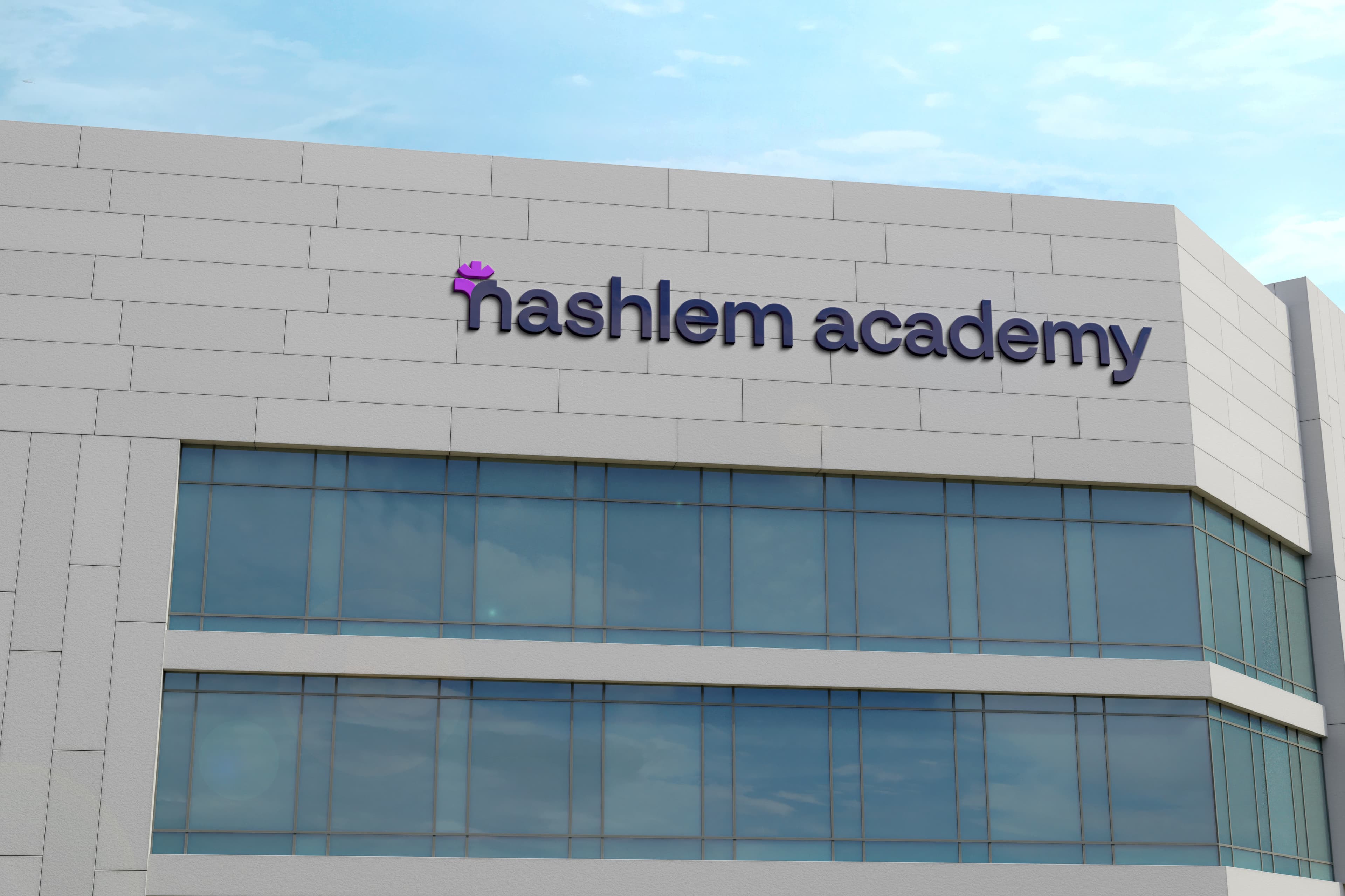
An academy teaching visual craft is judged on its own visuals before anyone reads a word of the curriculum. Nashlem had none to speak of.
There was no existing brand to read, so we started with a written questionnaire instead of a mood board. The point was to hear how the founder described the academy in her own words, then pull the themes out of those answers rather than impose a direction on top of them.
Confident, genuine, premium and trustworthy. This was the first thing that came back, and it ruled out anything playful.
The academy represents a fresh start and new possibilities for the people who enrol. That became the emotional core.
Contemporary now, but flexible enough to still work as the academy adds courses and grows.
Six keywords came out of the answers: hope, education, nurture, trust, modernism, creativity. Everything after this point was built to serve those six.
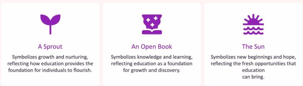
Three symbols pulled from the questionnaire answers, before any logo was drawn.
A sprout for growth and nurturing, because education is what lets people flourish. An open book for knowledge. A sunrise for new beginnings and hope.
Rather than pick one, we built a symbol that reads as all three depending on how you look at it, then integrated it into the letter "n" so the mark and the name are the same object. The concept came straight out of the founder's own answers, which is why it landed immediately instead of needing rounds.
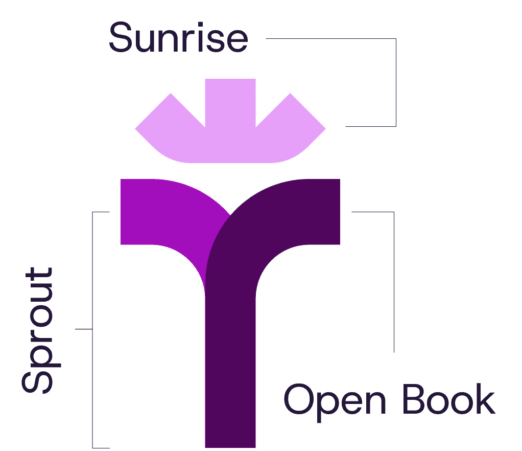
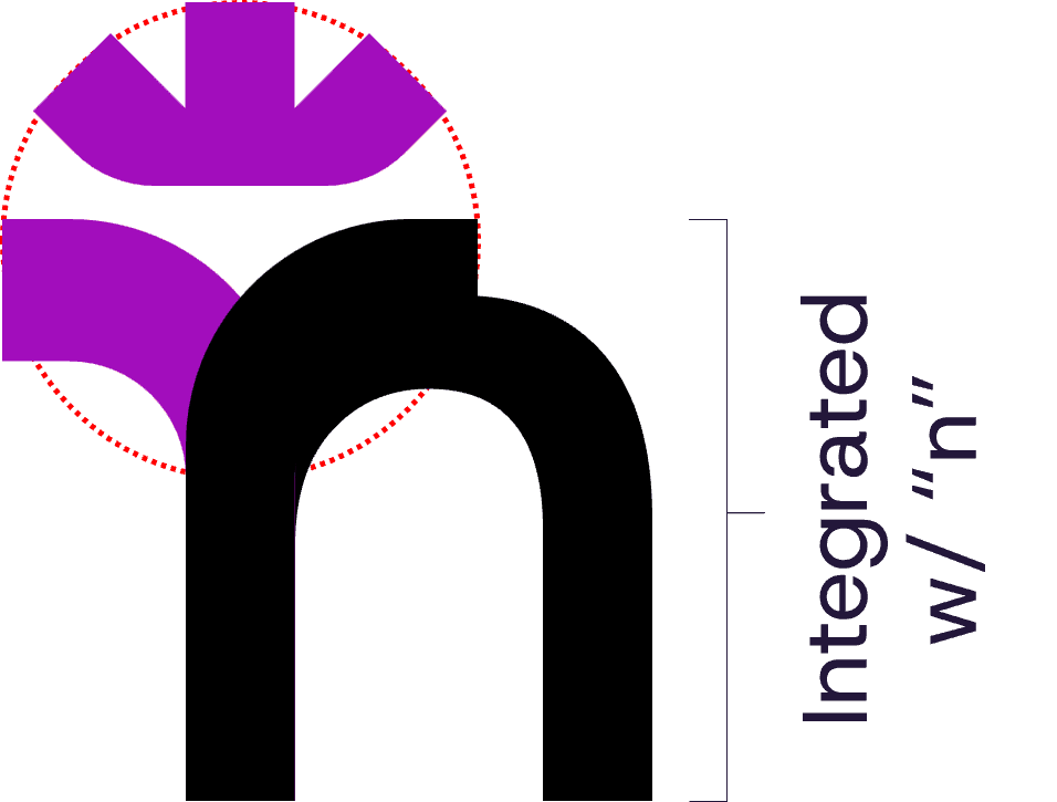
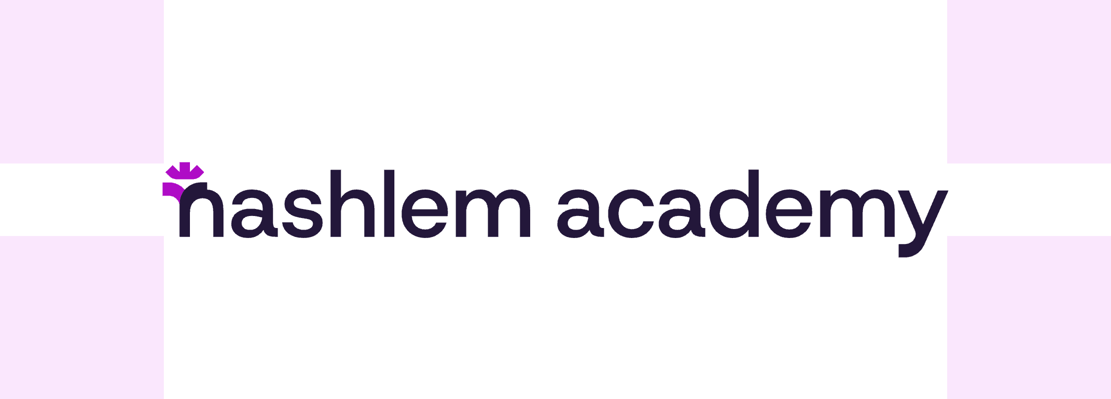
How the three symbols resolve into a single letterform.
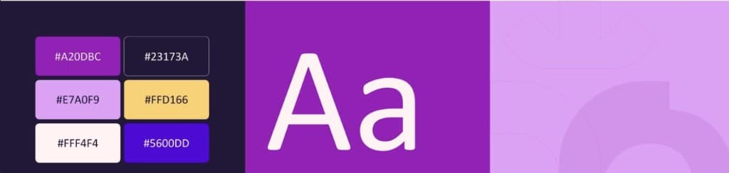
The visual system: palette, typography and graphic language.
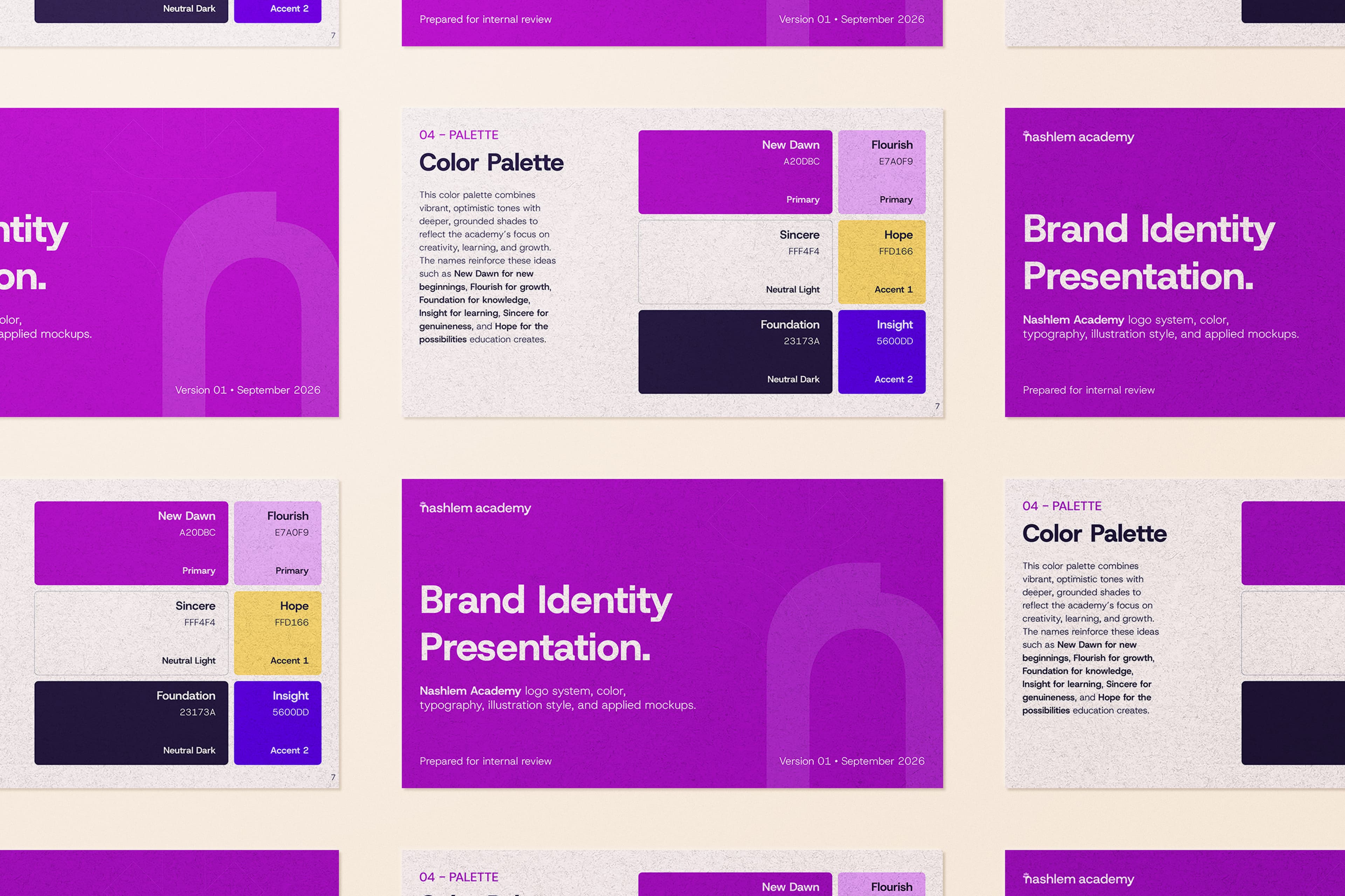
A purple-led palette that carries confidence and creativity, warmed with optimism so it reads as a place to start something rather than an institution.
Host Grotesk in Bold, Regular and Light. Modern and clean, with enough range to handle signage and long-form course material from one family.
The symbol itself, redrawn as a pattern with one side outlined, so the brand has something to say on a surface where the logo would be too literal.
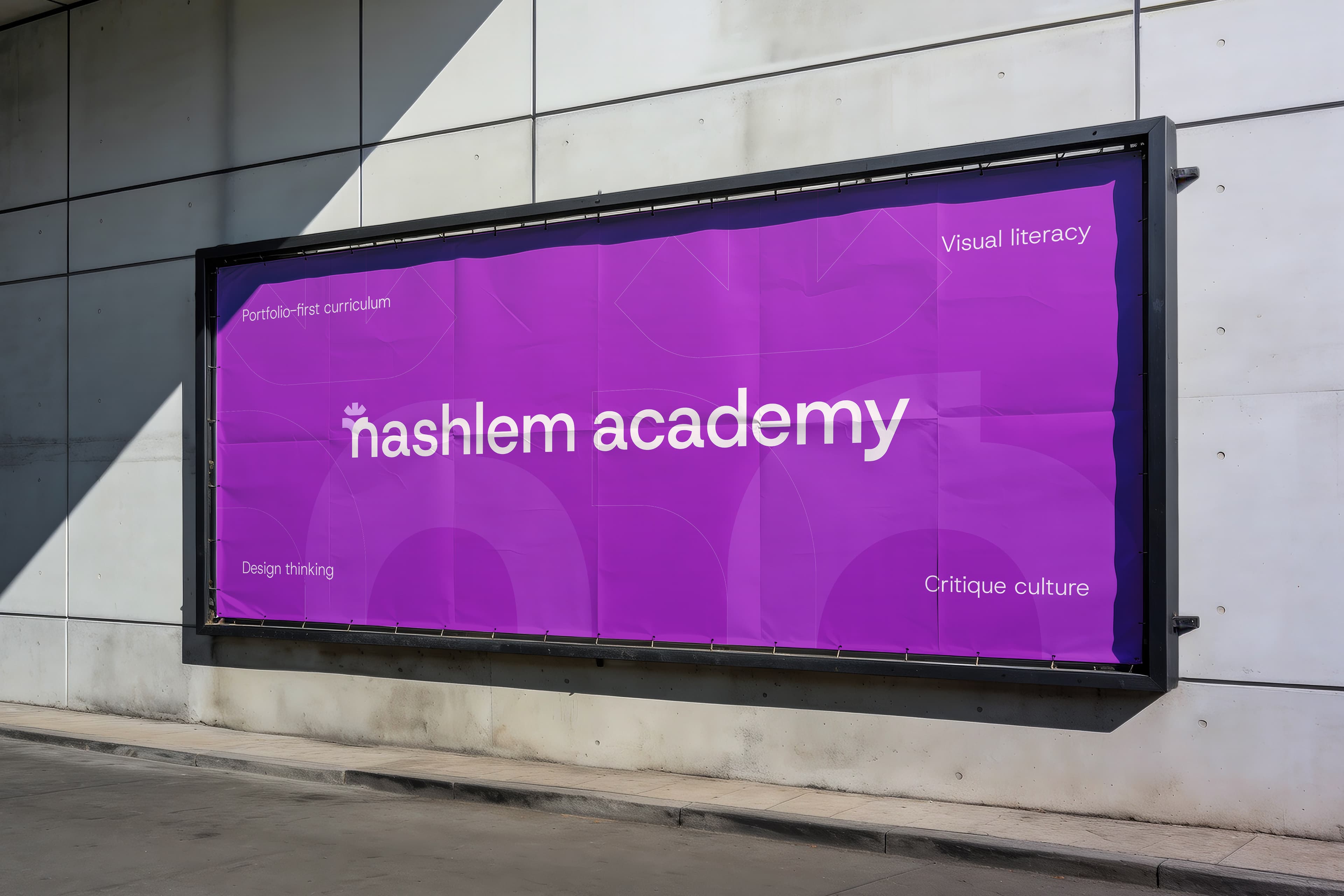
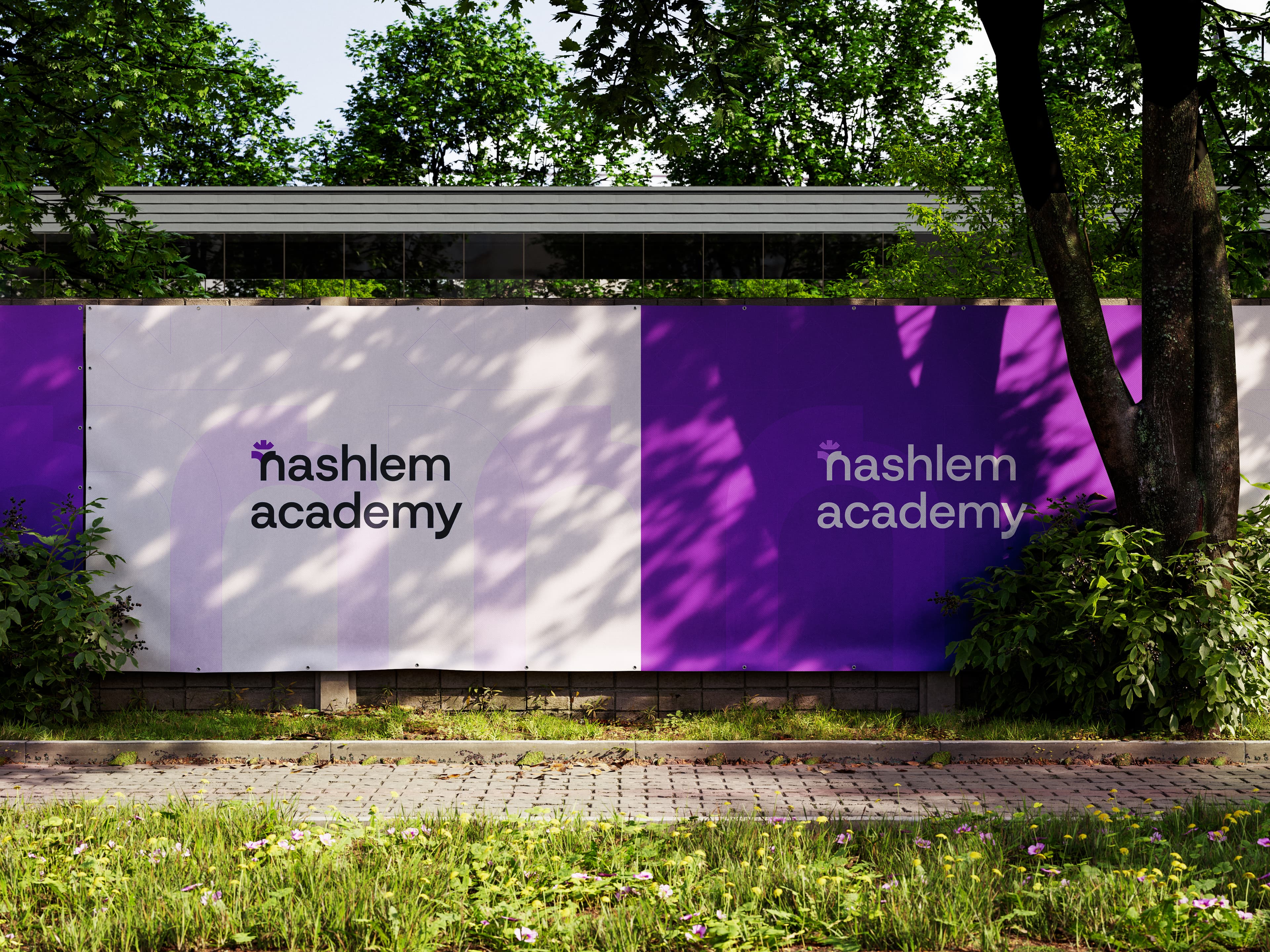
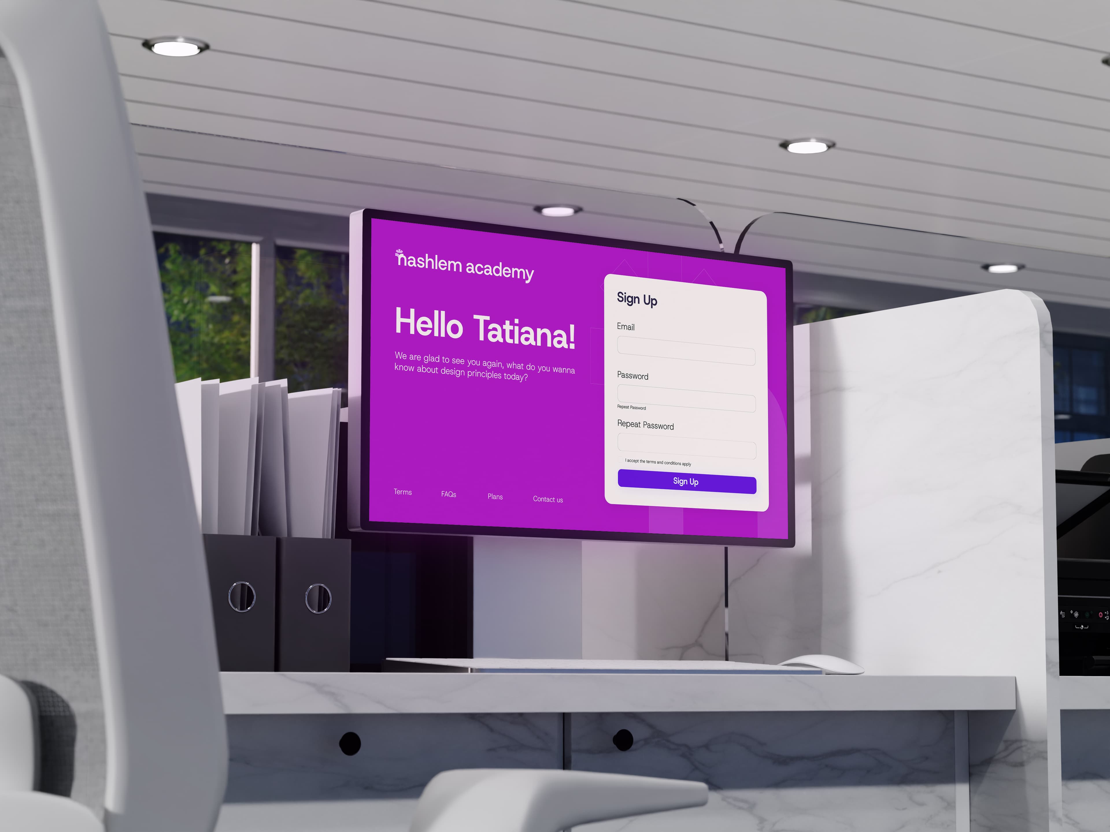
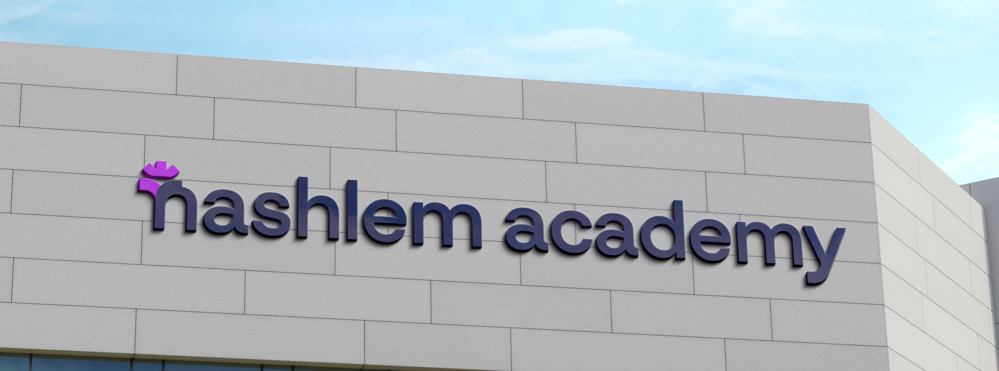
The system applied across signage, outdoor and screen.
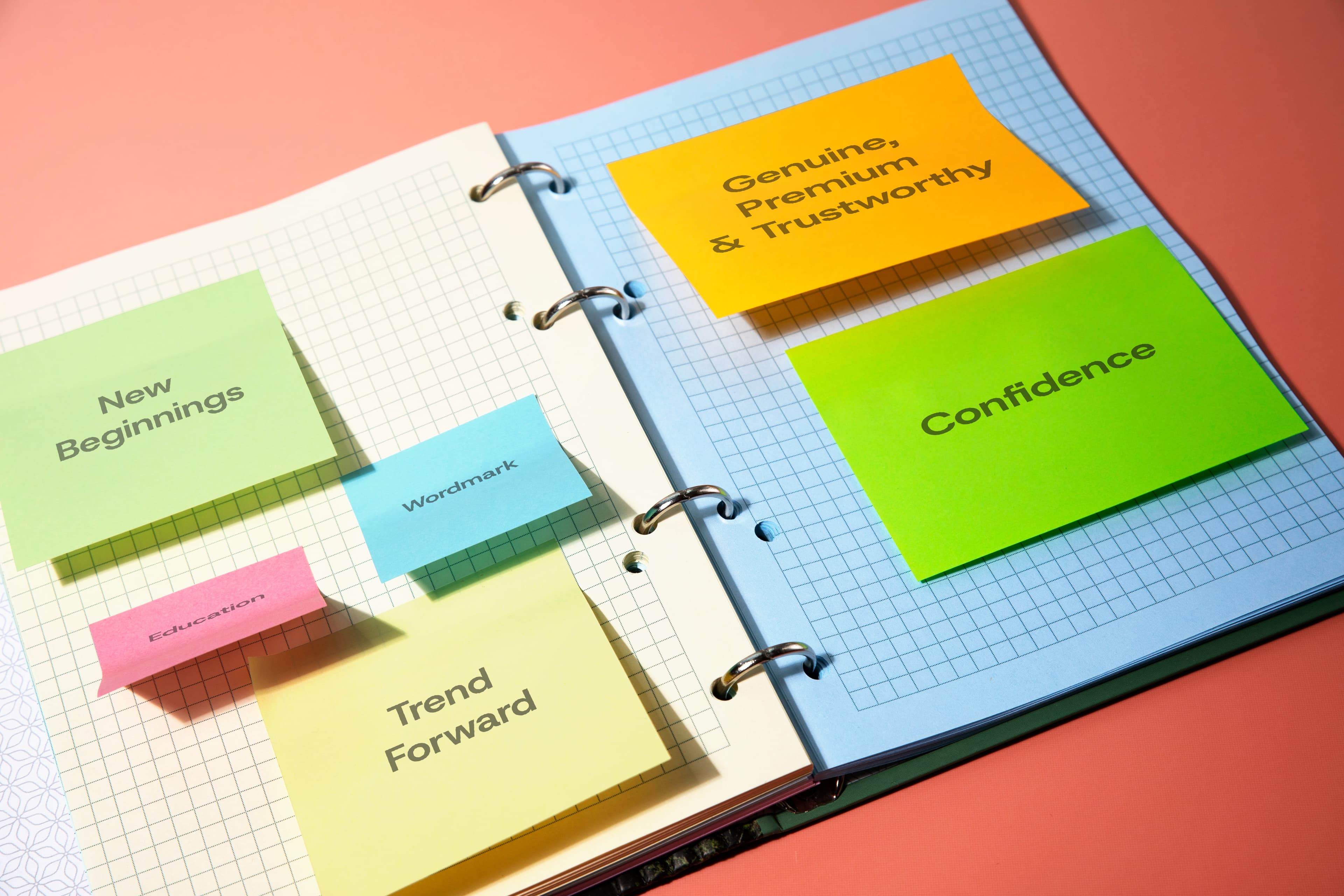
Where it started, and where it ended.
Nashlem now has a distinctive visual presence across its marketing and communication, and a system its own team can extend without coming back to us for every asset. The direction was approved on the first presentation, which is the part we care about most. Reading the brief properly at the start is what removed the rounds at the end.
Book a 30-minute call. We'll ask about your audience before we talk about design.